
No products in the cart.
A few weeks ago we expanded our map collection with views on several continents, all including a crisp shaded relief.
Today I want to talk about our map style we use for these kinds of maps.
‘Summit’ is a map style we have developed specifically for our shaded relief maps. These maps contain several layers with vector elements combined with a bitmap (photo) in the background representing the relief and bathymetry of the map area.
If you want to know more about these maps, I suggest you follow along as I explain those details.
You can grab our FREE map of Middle America (Central America if you like). This map is made in the ‘Summit’ style. Just download the map and open it up in Adobe Illustrator (CS3 and above).
Free Map of Middle America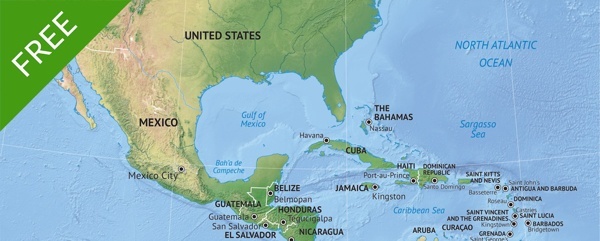
‘Summit’ maps all have a large and detailed shaded relief in the back. This shaded relief is a JPEG of 6000px wide and is well suited for use in print design, web design and more. At 300dpi, the JPEG is still 20 inches wide. We use ‘pixels’, so it is easy to understand how large the image is.
In an upcoming blog post, I will dive deeper into the difference between pixels and dpi. I will explain why there is no difference in file size or quality between a 300dpi 6000 pixels image and a 72dpi 6000 pixels image.
Take a look at this conversion table to have a clear understanding what 6000 pixels wide really means.
6000 pixels wide
| Web (72 dpi) | Web Retina (144 dpi) | Print (300 dpi) | |
|---|---|---|---|
| feet | 6.94 | 3.46 | 1.66 |
| inch | 83.3 | 41.6 | 20 |
| meter | 2.11 | 1.05 | 0.508 |
| centimeter | 211.5 | 105.6 | 50.8 |
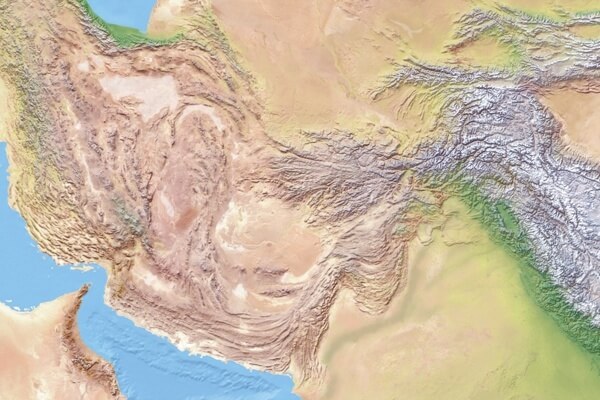
100% view on the shaded relief above (centered on Pakistan)
The layers that are present in the maps vary a bit depending on the content. In this map style, we have world maps with country names as well as region maps with lots of cities.
You can’t see it visually, but every country is a vector area that you can select and edit. You can find these country areas on the country layer. Out of the box, the country area has no stroke and no fill.
The grid lines are placed on 20 degrees interval.
Whenever possible, objects have names and we have sorted them in alphabetical order. You can see this in the layers palette.

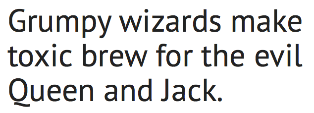
Example of font PT Sans, used in our map style ‘Summit’
The font used in the Summit-style is PT Sans.
For easy install, each map package contains those font files. Just double-click the TTF-files and follow the instructions depending on your operating system.
PT Sans was originally developed for the project ‘Public Types of Russian Federation’. This font was released under a libre license and can be used freely in any project.
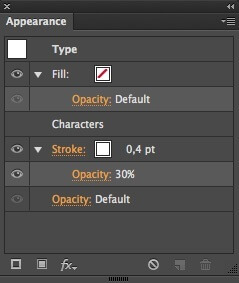
Appearance palette showing settings for semi-tranparent stroke around type
If you made maps yourself, you know it can be quite a challenge to make the text readable on top of a colorful background like these shaded reliefs. To be sure the text can be read at all times, we did a small trick with it. By using the appearance palette, we added a stroke of 0,4 pt with an opacity of 30%. This way the text is more separated from the background and much more readable on our shaded relief. Depending on the background you use, it could be a good idea to change those values to have a thicker stroke or less opacity for instance. Just keep in mind that these kinds of effects are there to make the text more readable. In my opinion, it comes down to this: the less noticeable, the better.
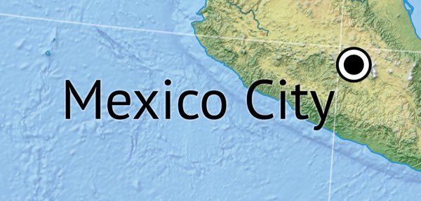
Example of type with semi-transparent stroke in the background
This blog post is not intended to be a comprehensive tutorial on editing vector maps. But still I want to give you a nice color palette that plays well with Summit-maps.

Colors used to give countries a fill in our map style ‘Lucid’
It is a set of graphic styles from another map style of ours called Lucid and not a real color palette. These colors are built up out of 7 base colors that have the ‘Inner glow’ effect applied to them.
Lucid Colors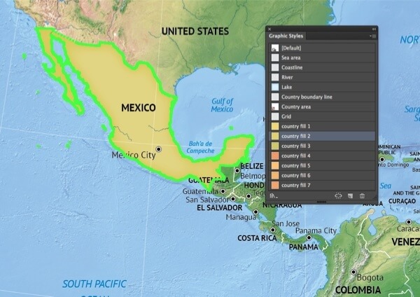
Give a country area a color by selecting the graphic style of your choice
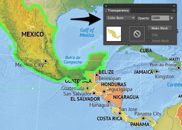
Play with blend modes, to achieve some nice effects
Now, select your object (for instance a country area on the layer ‘Country area’) and click on the graphic style you want to use. The graphic style is now applied to the object you just selected. By changing the blend mode in the Transparency palette, you can achieve some nice effects.
We have two main map packages in our store: printable and vector. Below I will give you an overview and explanation of the most important file formats in each package. The vector package is the most comprehensive. It contains all the files of the printable package and several layered vector oriented files. By downloading the free map mentioned on top of this post, you get the vector package automatically.
| Printable map package | Vector map package |
|---|---|
| JPEG (6000px wide) | JPEG (6000px wide) |
| JPEG medium (3000px wide) | JPEG medium (3000px wide) |
| JPEG small (1500px wide) | JPEG small (1500px wide) |
| JPEG shaded relief only (6000px wide) | JPEG shaded relief only (6000px wide) |
| Non-layered PDF | Non-layered PDF |
| Adobe Illustrator CS3 AI layered file | |
| Adobe Illustrator layered PDF |
All JPEGs are in RGB and exported in Photoshop at the highest possible quality. For your convenience we are providing 3 image sizes: full size (6000px wide), medium (3000px wide) and small (1500px wide).
The bitmap (photo) of the shaded relief without any vector objects or text on top of it. Great if you want to show only the shaded relief, or useful as a starting point for a custom map from scratch. The density of the pixels is large enough to use in your design for images up to 20 inches wide 300dpi.
The non-layered PDF has the same content as the vector files, except there are no layers present. Text is editable, all vector objects are selectable, but due to the lack of layers it can be hard to edit the map to fit your needs. Lots of edits can be done more easily with the files of the vector version. Nonetheless, this vector PDF is included in every printable map package.
The best and most extended version of the map. You can open it up with Adobe Illustrator version CS3 and up, some versions of CorelDRAW and other software should be able to open this file in all its glory. Everything is layered and easily selectable and editable. You can resize this map without any loss of quality, although, to have the best possible sharpness of the shaded relief, you need to be aware of its file size. But, as you can see above, 6000px wide is a lot of goodness to work with.
We are providing this file format to give you more possibilities in using the map in software other than Adobe Illustrator. This PDF is layered, but it depends on the software that you use if you will see those layers
Maps made in other styles also contain an EPS file format. But we had to do something to limit the file size of the actual package you get when purchasing a map. With the presence of a huge shaded relief, we had to drop this EPS-file for our Summit-Maps.
It should be no problem though, as when you purchase a map, you can contact us to obtain a particular file format that is not present in the map package. We will do everything we can to help you out, but we can’t promise that we can deliver every file format out there. Just contact us if you need to.
I hope you will now be up and running with our map style ‘Summit’. If you have some great ideas for editing these maps, or if you want to share your thoughts about this post, or perhaps about our map style ‘Summit’, do so in the comments below.
